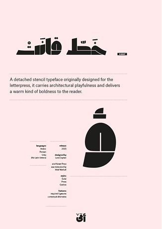
Kanat
A detached stencil typeface originally designed for the letterpress, it carries architectural playfulness and delivers a warm kind of boldness to the reader.
Family Editable Overview
Sample Typesetting

Typeface Showcase
Kanat Solid
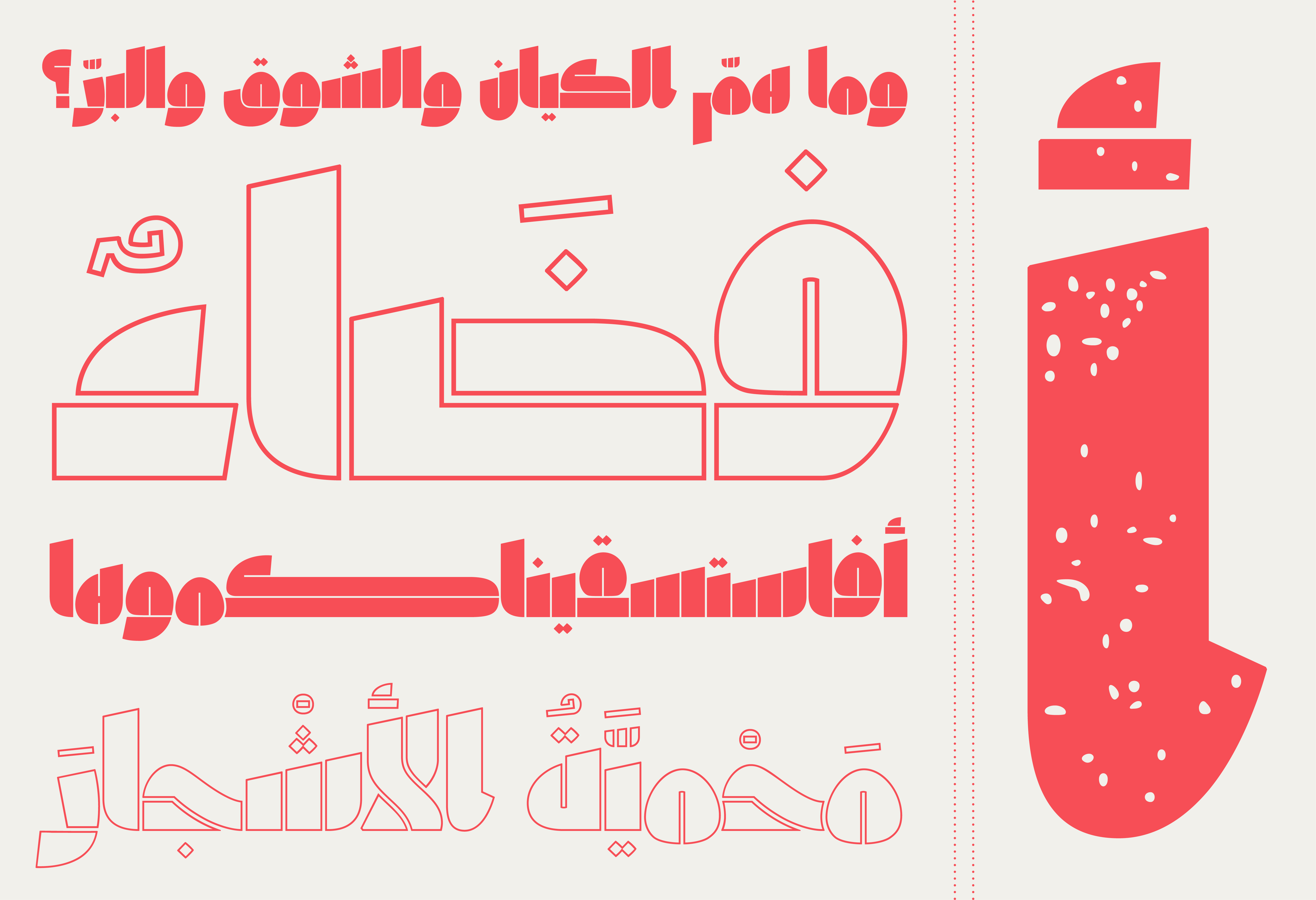
والآن
Kanat Press
هو الواحد بلا وحدانية،
Kanat Outline
وهو الفرد بلا فردانية.
Kanat Solid
بلا ظاهرية
Kanat Solid AR+LT
astonishingly
Kanat in use

Cards at the Wereld Museum Amsterdam Shop
Letterpress prints by GWA

B. Cotnoir, Alchemy: The Poetry of Matter
Khepri Press
Information & Credits
detached stencil
3 styles
released in 2023
48pt and above
Arabic, Persian, Urdu
Lara Captan
Maria Montes (Latin)
Hilal Mutluel (Press)
Kanat is a display family that dialogues between digital and moveable type technologies. It is ideally used from size 48pt and above and is meant to highlight words playfully or to use them as an architectural space. Kanat Outline allows for overlays with the Solid version. And Kanat Press echoes the warmth and texture of its sister wood typeface.
Kanat Solid was initially drawn in 2017 to be CNC-milled into the Kanat wood typeface, housed at the [typo]Grafische Werkplaats Amsterdam [GWA].
The design sprung from a question: How to create an Arabic wood typeface that embraces both Arabic script tradition and the letterpress's constraint of having letters fit into a physical, rectangular block? As a result, the Kanat family is based on one of the earliest forms of Arabic calligraphy [a style generally known as Primary Kufic] and is fully detached to optimize itself for moveable type technology.
The typeface is a homage to Wiek Molin, the late director of the GWA who, along with current director Corine Elemans, were the initiators of the wood-type project. Kanat is the Turkish word for "the wing."
You can read the full story here.